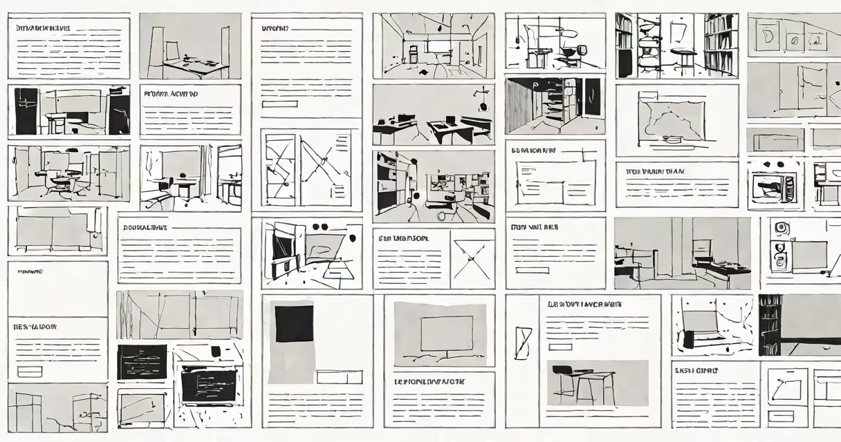
Wireframes in design are skeletal layouts that define the structure, content hierarchy, and interactive elements of a digital interface without visual styling. They serve as early-stage blueprints for websites, apps, or software, prioritizing function over form. These drafts are typically created using simple shapes, lines, and placeholder text to clarify how users will go through and interact with a product.
Designers build wireframes to test ideas quickly, align stakeholders, and reduce costly revisions later in development. They focus on placement of menus, buttons, forms, images, and text blocks. Visual details like color, typography, or branding are excluded until the layout's logic is confirmed. This separation ensures decisions are based on usability, not aesthetics.
According to the Nielsen Norman Group, wireframes improve team communication by making abstract concepts tangible. A 2021 study found that teams using wireframes during planning reduced redesign requests by 40% compared to those who skipped this step. The absence of visual polish prevents premature focus on appearance, keeping attention on user needs.
Wireframes operate as functional maps of a digital interface. They show what goes where and how users move through a screen. For example, a login page wireframe includes a username field, password field, "Submit" button, and a "Forgot Password?" link-all arranged in a logical sequence. The designer doesn't specify font size or button color yet. Instead, they ensure the fields are positioned for easy access and follow standard UX patterns.
Each element is labeled with a placeholder such as "[Text Input]" or "[Image Placeholder]." These labels help developers understand intent. A navigation bar might be marked "Main Menu - 5 Items," indicating the expected number of links. This clarity reduces ambiguity during handoff between designers and engineers.
Wireframes are often created in tools like Figma, Sketch, or Adobe XD. Some teams still use paper sketches for rapid ideation. The goal is speed and iteration. A single concept can be revised five times in under an hour, testing different placements for a call-to-action button or adjusting spacing between sections.
Wireframes vary in detail and purpose. The most common classifications are low-fidelity and high-fidelity, though some teams use intermediate levels.
| Type | Detail Level | Use Case | Example |
|---|---|---|---|
| Low-Fidelity | Minimal detail. Boxes, lines, placeholder text. | Idea generation, stakeholder feedback, rapid iteration. | Pencil sketch of a mobile app home screen with labeled rectangles for "Profile," "Feed," and "Settings." |
| High-Fidelity | Specific dimensions, actual content, realistic spacing. | User testing, developer handoff, client approval. | Digital wireframe in Figma showing exact pixel dimensions for a dashboard grid with sample data. |
Low-fidelity wireframes are ideal for early brainstorming. They're fast to make and hard to misinterpret as final designs. High-fidelity versions are used when precision matters-such as when testing how much space a list of items takes on a tablet screen.
A common mistake is treating wireframes as final deliverables. The interaction design firm NN/g warns against this: "A wireframe is not a finished product. It's a tool for validation." Over-detailed wireframes can mislead clients into thinking visuals are complete, leading to late-stage changes.
Wireframes are central to UX and UI workflows. They appear early in the design process, often before any visual design begins. Their primary role is to validate functionality and user flow before resources are invested in coding or branding.
For instance, when designing a food delivery app, a wireframe shows the sequence: home screen → search bar → restaurant list → menu selection → checkout. Each screen is mapped to ensure users don't lose their place. If the "Add to Cart" button disappears behind a scrolling list, the wireframe reveals the flaw before development starts.
At Airbnb, wireframes were used to simplify the booking process. Teams tested multiple versions of the calendar selection interface. One version required two taps to choose dates; another used a single drag gesture. User testing showed the drag method reduced errors by 32%. The winning wireframe was then passed to developers.
Another benefit is cross-team alignment. Engineers, product managers, and marketers can all review a wireframe and agree on what the feature should do-even if they don't understand design tools. This shared understanding prevents miscommunication during sprint planning.
Many people confuse wireframes with mockups or prototypes. A wireframe is not a visual design. It lacks color, icons, and custom fonts. A mockup adds these elements to simulate the final look. A prototype goes further-it allows users to click through simulated interactions.
For example, a wireframe of a weather app shows a blank box labeled "Current Temperature" and a row of icons for "Sun," "Cloud," and "Rain." A mockup replaces those with actual weather symbols and a gradient background. A prototype lets users tap the icon to see a detailed forecast.
Another misunderstanding is that wireframes require design expertise. While professionals create them, anyone can draft a basic version. A product manager can sketch a phone screen on paper, label the buttons, and test it with users. The key is consistency in labeling and structure-not artistic skill.
I once observed a startup team use sticky notes on a wall to wireframe a new dashboard. They placed each component-charts, filters, export button-on a note, rearranged them during a meeting, and validated flow with customer interviews. The result was a working layout in under 90 minutes. This method proved effective because it focused on function, not visuals.
Even experienced designers sometimes skip wireframing when under pressure. But research from the Interaction Design Foundation shows that skipping wireframes increases project rework by up to 60%. The cost of fixing a layout issue after code is written is higher than adjusting a sketch.
Wireframes in design are essential tools for building usable, intuitive interfaces. They prioritize user needs over visual appeal, enabling teams to test and refine structure before investing in development. By focusing on placement, hierarchy, and interaction, wireframes prevent costly mistakes and align stakeholders early.
When you begin a new project, start with a wireframe. Test it with users. Refine it. Only then move to mockups or code. This disciplined approach separates successful products from those that fail to meet expectations.